
BTS: Card Border Designing (Part 1)
The thought process behind designing Stained Glass Tarot's card border

Hi Tarot fans! I wanted to share some of the design creation process with you as I work on the Art Book that’ll accompany our Stained Glass Tarot deck.
First though, I want to let you know that the Stained Glass Tarot now has an expanded timeline and scope. We’ll be making a fully illustrated ART BOOK and ordering prototypes of everything before launching our campaign. That means we’re now launching in Fall of 2025. I’m hoping to share the entire process of making an anthology deck with you here, and I’ll be highlighting a lot of our incredible illustrators.
With Chromatic Fates, our first deck, I wanted to create a border style that would unify a huge range of art styles. With that deck, I ended up going with a rectangular border for every card but drawing in a custom gradient that matched the color palette of each painting. That way the art styles would have the same border treatment, and the entire deck would be cohesive, but the colors wouldn’t clash with the palettes the artists chose to use for their own unique drawings.
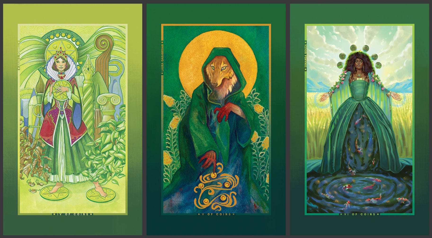
With the Stained Glass Tarot project, I noticed immediately that the drawings often incorporated window elements of their own, and I really didn’t want to eclipse those, or to restrict the compositions that artists wanted to go with. This project is much more heavily focused on design instead of straight color, so I wanted to reflect that with a border style that would evoke the stained glass style.
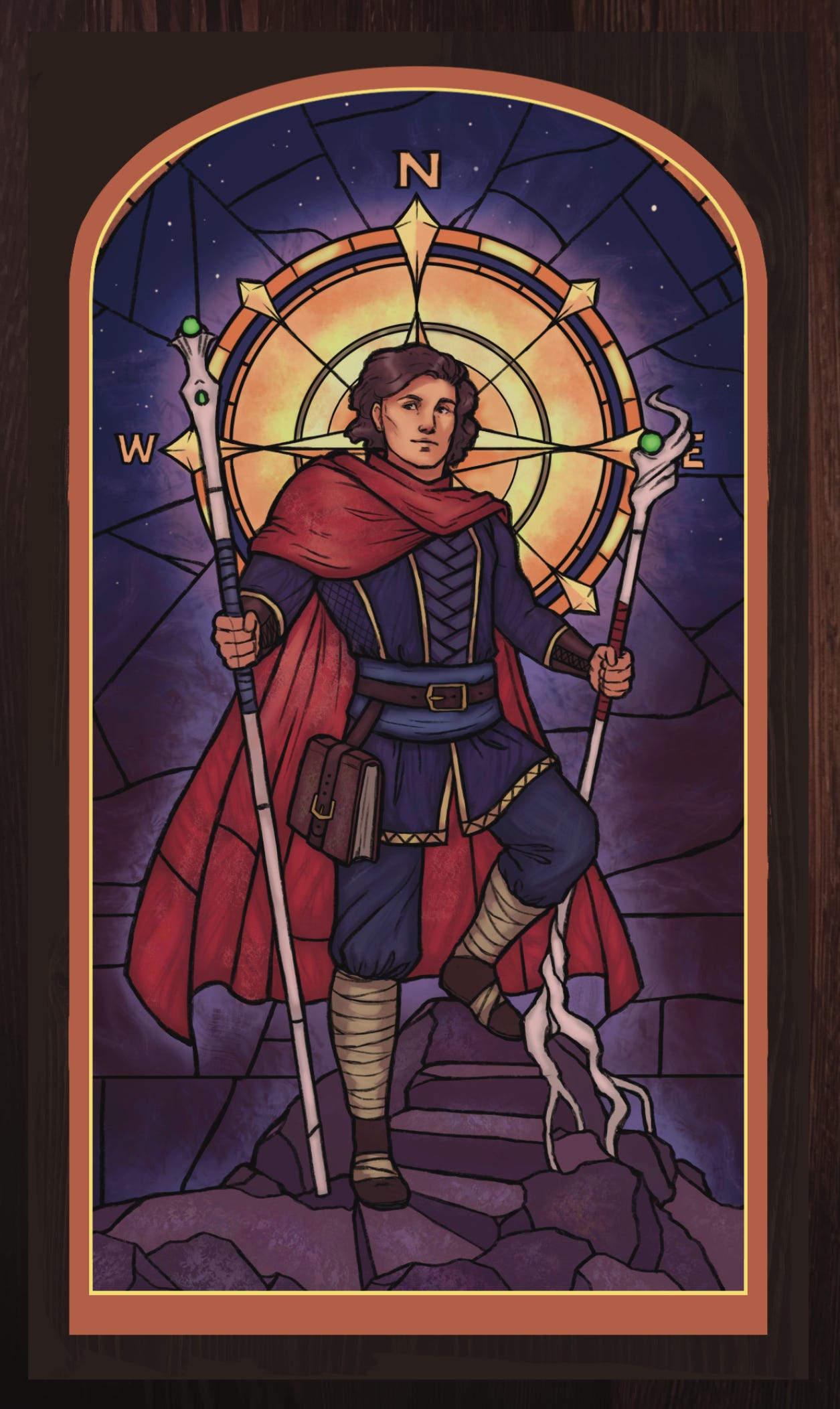
I ended up drafting up a series of border options that mirrored medieval stained glass windows and traditional glass framing elements. I’m using Samantha B. Lucas’s art for Two of Wands to show you the mockups of those border options below:
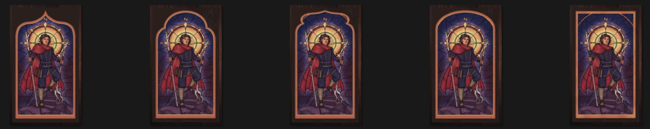
As you can probably see with this particular option, sometimes the artwork has really beautiful framing elements that would be eclipsed by some of these border options, so I want to be careful to work with the artwork on a case-by-case basis and make sure the borders enhance the card and don’t cover up anything neat!
As I continue to refine the card borders, I’ll be doing a “Part Two” on these so you can all see how they come out- what color strategy we end up with, how detailed/realistic they end up being, and how often they’re broken to let art elements overlap on top of them.
Thanks for reading!
-Stephanie
Some links:
Sam Lucas’s art can be found here